PUBLICATION
What is shadcn/ui?
If you've been building anything with React and Tailwind in the past couple of years, you've almost certainly run into shadcn/ui. It is a collection of reusable UI components for React, built on top of Tailwind CSS and accessible primitives like Radix UI. But calling it a "component library" is a bit misleading, because you don't install it as a dependency. Instead, you use a CLI to copy component source code directly into your project:
pnpm dlx shadcn@latest add dialog
That gives you a dialog.tsx file in your codebase. It's your code now. You can read it, change it, delete half of it — whatever you need. There's no node_modules black box, no theme tokens to override, no !important hacks. You just edit the file.
Under the hood, each component is a thin, nicely styled wrapper around a headless primitive (Radix or Base UI) that handles all the accessibility and keyboard interaction stuff you don't want to implement yourself. The styling is Tailwind, the structure is yours to own.
shadcn create
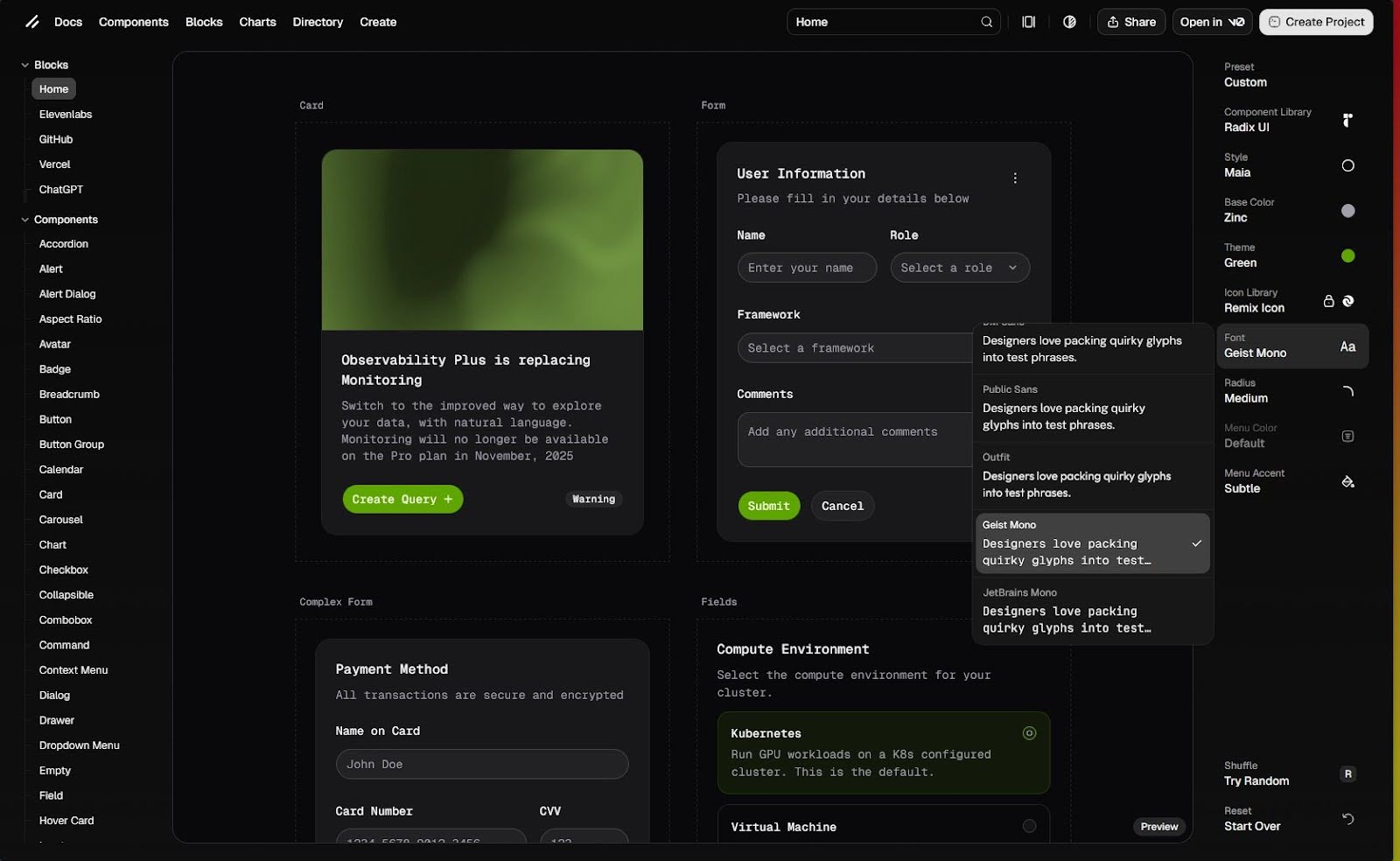
shadcn/ui has a very useful tool that will let you customize and see how your UI library will look even before you start. You can pick your base component library, theme colours, choose from a variety of icons, pick the font, and more (image 1). It’s kind of like the character creation screen in video games.
.jpg)
Image 1. Customizing your UI
After you’re done customizing your UI, you can pick your preferred framework and you will get a command that you can paste into your terminal and create your project (image 2). Your changes will be preserved in the URL, so you can share your custom UI with colleagues (or bookmark it for later use). This is what we’re working with today.
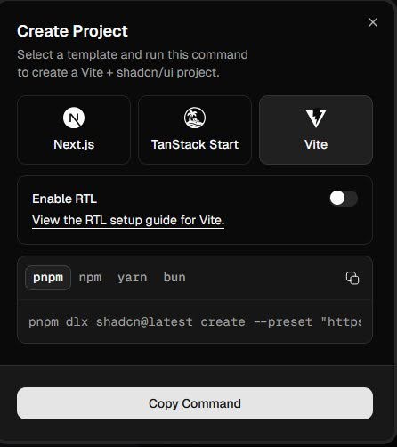
Image 2: The generated command for our project
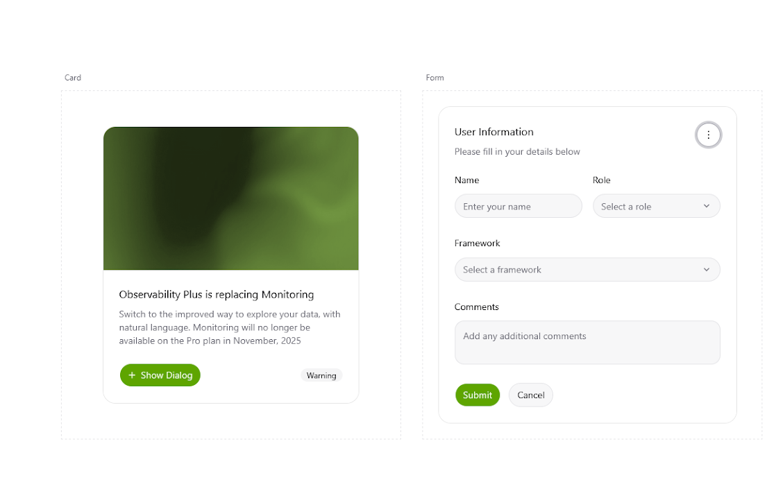
After running the command, our project is generated and we can run the dev server using pnpm dev. We see the components that are already in our codebase rendered in the default example.
.png)
Image 3: The default shadcn/ui example after creating the project
Adding components from the shadcn library
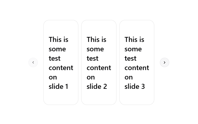
Let’s say we have a need for a carousel, but not for the other components that a UI library might offer. With shadcn/ui, we can pick what components we want to include in our project, with the added bonus that the code for them is in our codebase.
We are going to add the carousel component by running the pnpm dlx shadcn@latest add carousel command. For a quick start we can use one of the examples from the shadcn documentation:
.png)
Adding blocks from the shadcn library
If we need something more complex, shadcn/ui offers what they call “blocks”, which are ready-made UI components that are built with the primitive shadcn/ui components such as buttons and cards. Installing one is as simple as the previous example. We run the add command for the block we want, for example the sidebar block:
npx shadcn@latest add sidebar-01
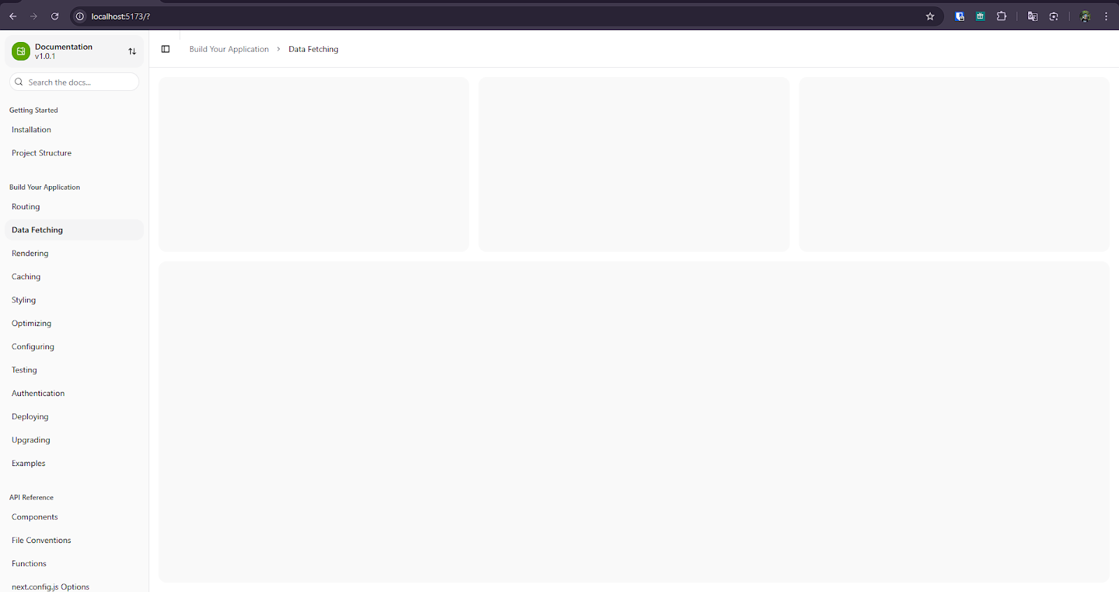
Just like that, we have a fully configurable and accessible sidebar component that we can use in our app:
Closing words
shadcn/ui is a library that’s been growing in popularity, and for a reason. With a CLI that drops component source code straight into your project and a foundation built on accessible headless primitives, it delivers something that a lot of UI libraries miss: giving you a great starting point without taking away control. My honest advice: if you're starting a new React + Tailwind project today, just run npx shadcn@latest init and see how it feels. Worst case, you don't like it and you delete the components folder. Best case, you save yourself a ton of time and end up with code you actually understand and control.